Mobility Profiling
Term Harvard Graduate School of Design Spring 2021
Course Data Visualization and Physicalization Through Wagashi Expression
Instructor Sawako Seijima
Partner Xinyi Chen, Jiaying Qin
The COVID-19 pandemic has had a profound impact on urban life, with the number of people moving around cities dropping to unprecedentedly low levels. The pandemic's disruption of urban transportation and physical job sites has resulted in significant changes to mobility and behavioral patterns in cities.
We see the pandemic as an intriguing case study to better understand how mobility behavior varies across different demographic groups. Specifically, we are examining the relationship between mobility patterns and poverty rates, in the hopes of opening up new insights into poverty in the city. By analyzing these changes, we aim to create a framework that can be applied to other cities to inform urban planning and policy.
We believe that the pandemic's impact on urban mobility has sparked a much-needed debate about how cities should be built and how they can better respond to current and future challenges. Our study is focused on New York City, which has been one of the hardest-hit cities in the world. By examining the impact of the pandemic on mobility and poverty in New York City, we hope to gain insights that can inform urban planning and policy decisions in other cities. Our ultimate goal is to create more equitable and sustainable urban environments that meet the needs of all residents.
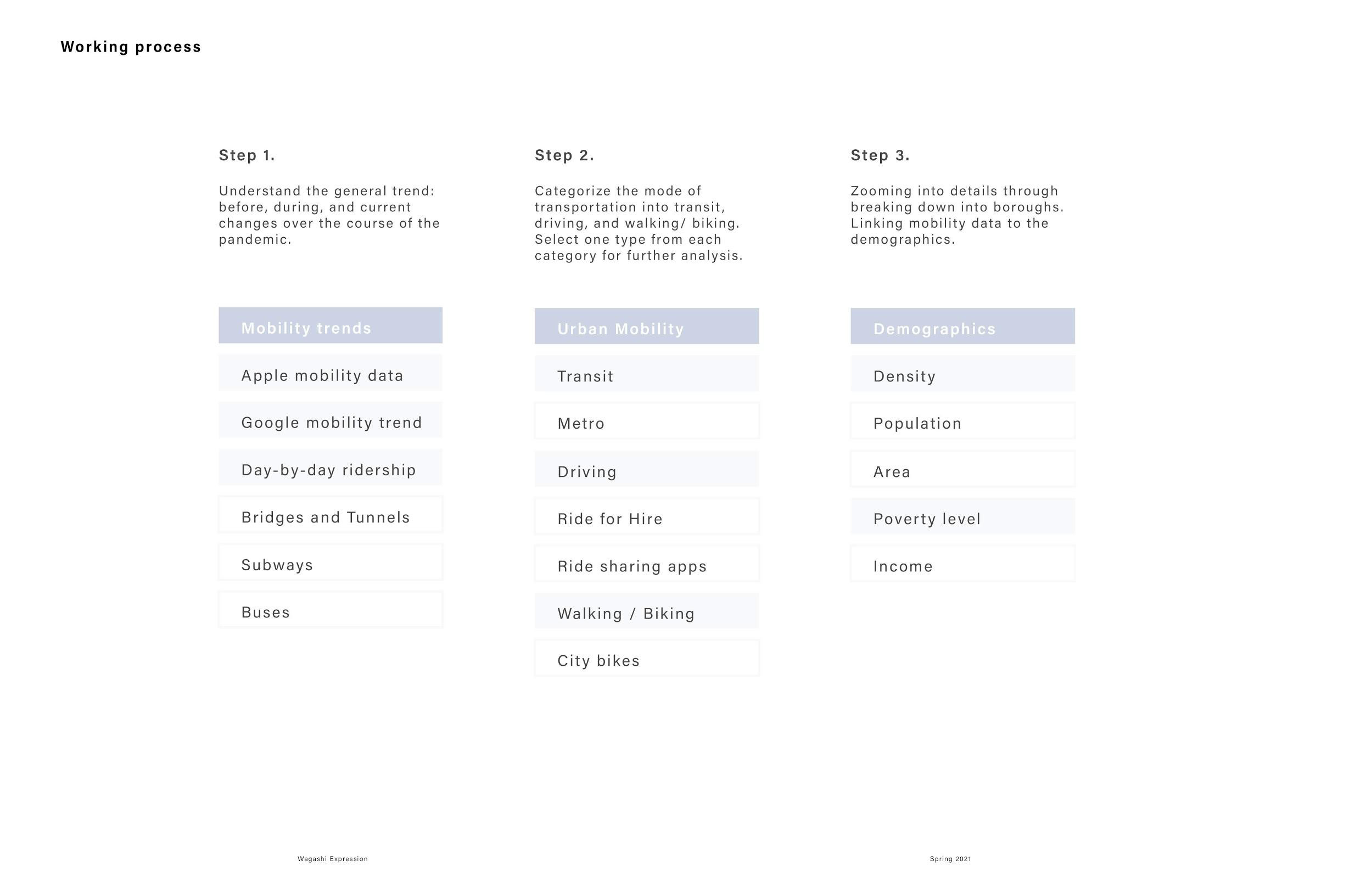

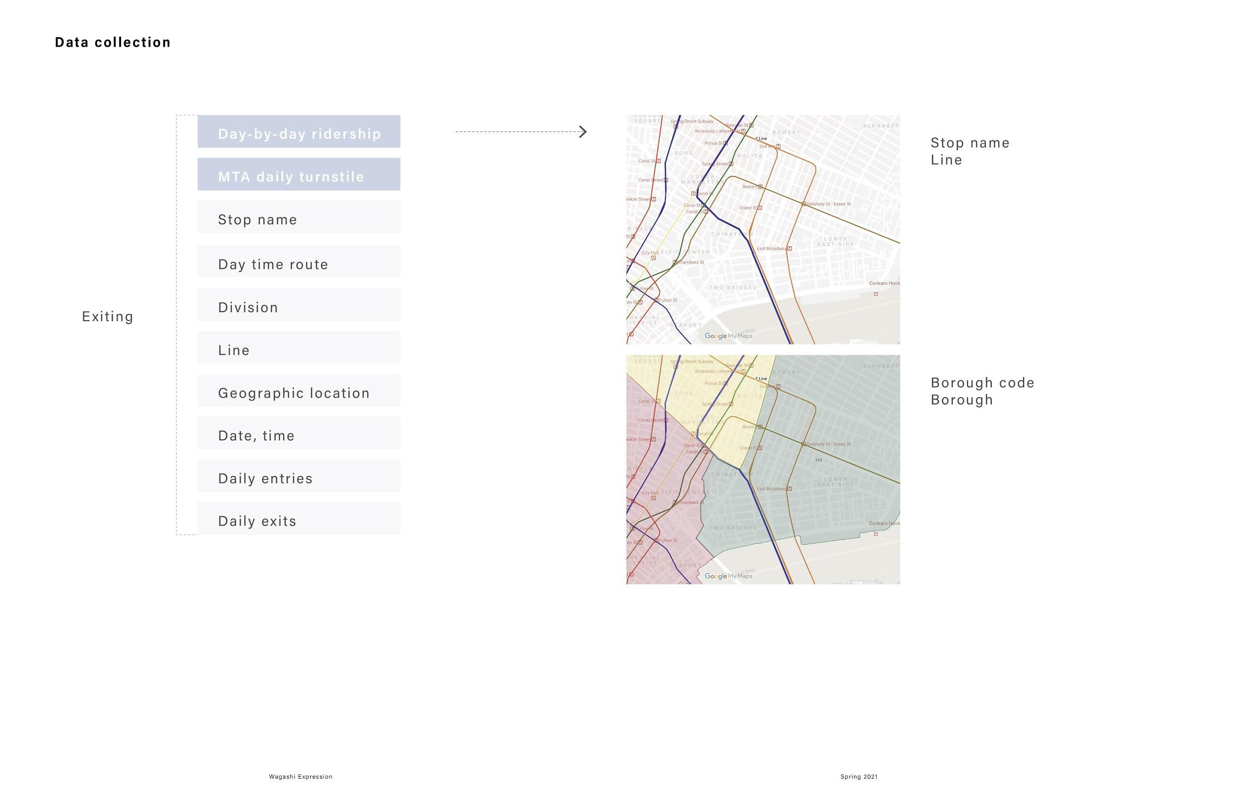
Diagram: Working Process and Data Collection
1.0
DATA COLLECTION
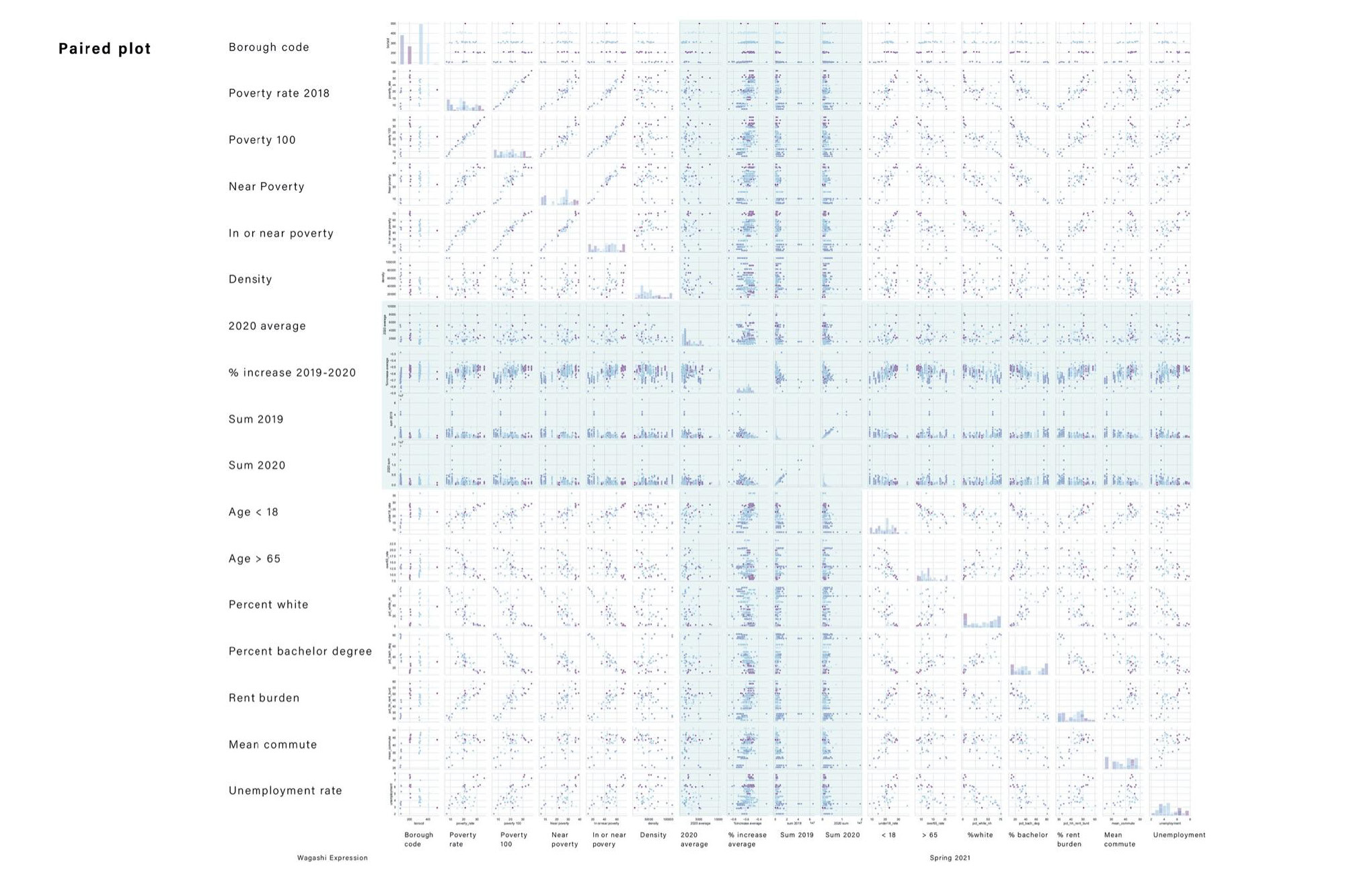
We started our research by studying the mobility trend of metro ridership before, during, and after the pandemic. Our process can be explained by extracting data from ‘Day-by-day ridership’ and ‘MTA daily turnstile’, and categorizing each stop based on their geographics locations / borough code. By doing so, we can later draw correlations with information such as poverty measures and decennial census datasets.
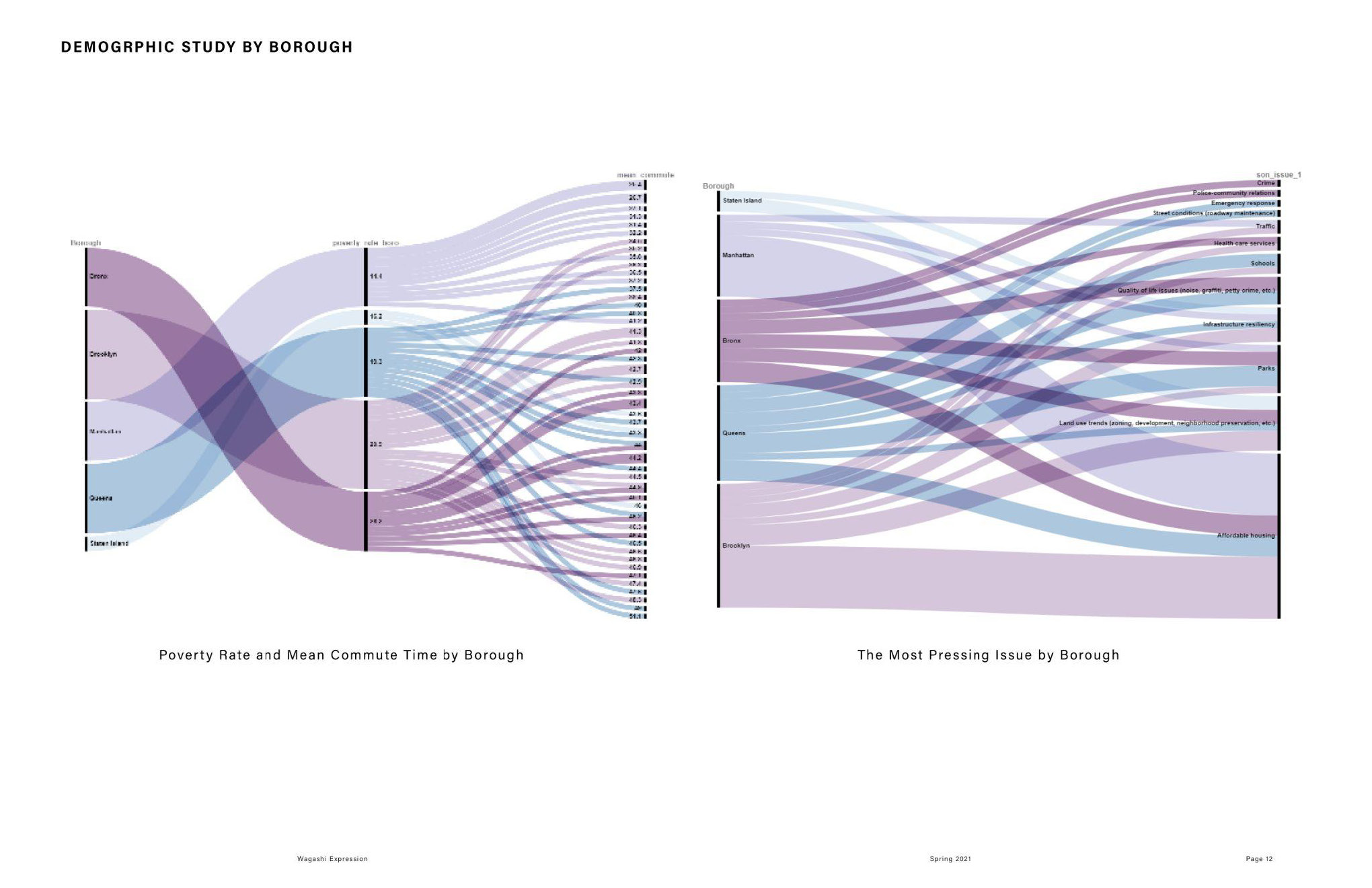

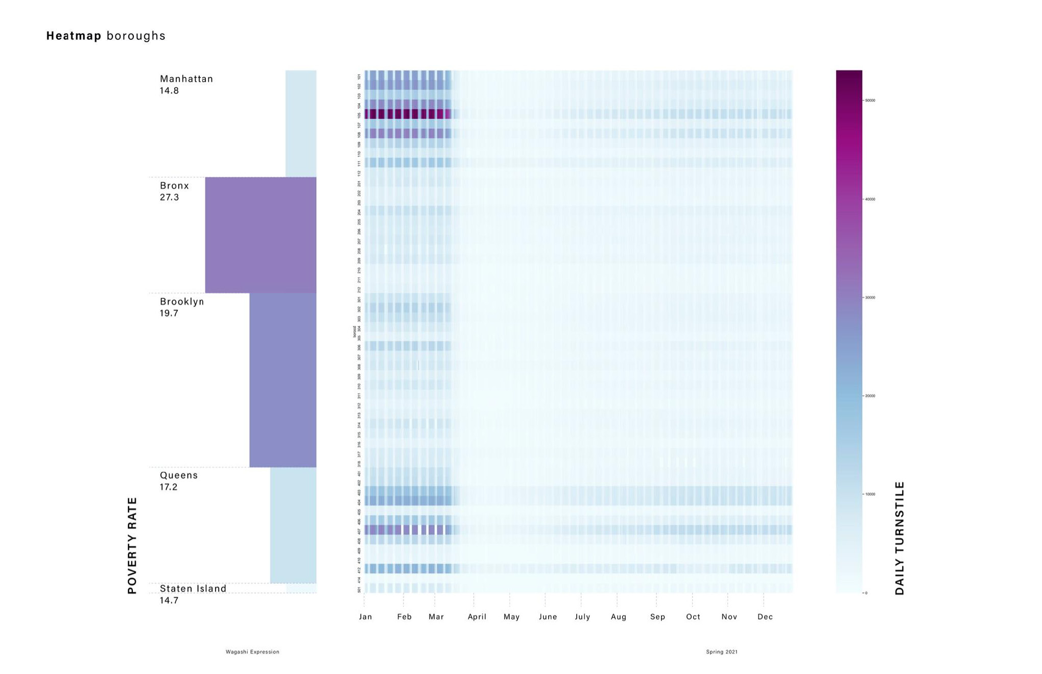
Diagram: poverty rate, pressing issues, density, mean commute time
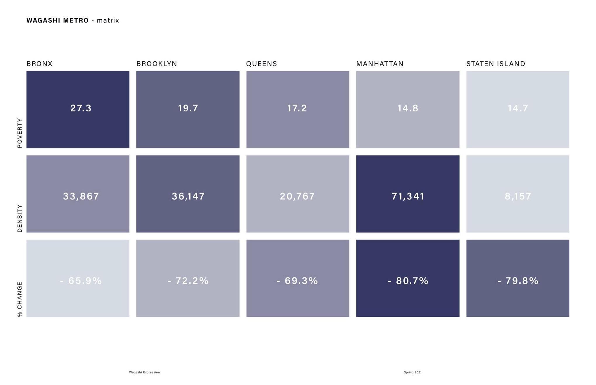
2.1 DEMOGRAPHICS
The ranking of borough with highest to lowest poverty rate is Bronx, Brooklyn, Queens, Staten Island and Manhattan. The graph on the right shows a trend of the higher the poverty rate the borough has, the higher commute time residents who live in the borough will take.
In terms of Population density, Manhattan has the highest density while Staten Island has the lowest density. Bronx has the highest poverty rate, and then Brooklyn, Queens, Staten Island and Manhattan.
In terms of Population density, Manhattan has the highest density while Staten Island has the lowest density. Bronx has the highest poverty rate, and then Brooklyn, Queens, Staten Island and Manhattan.
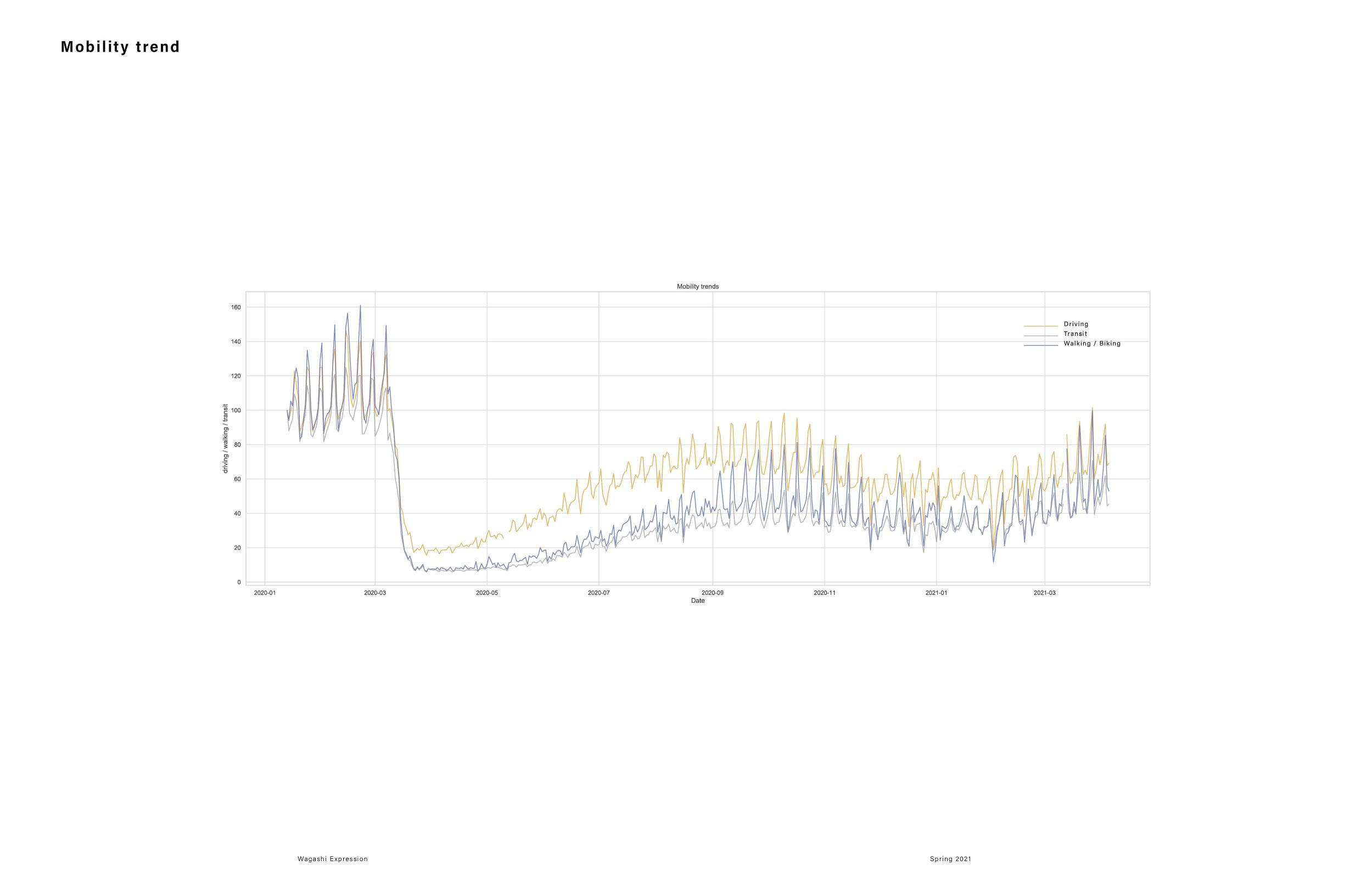
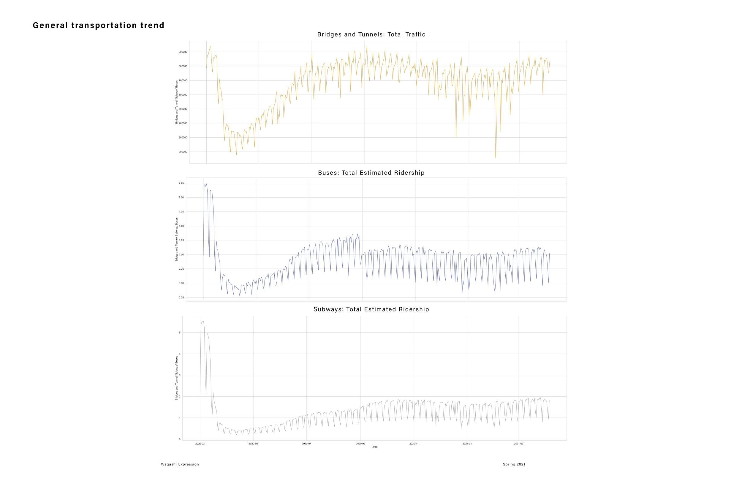
Diagram: Mobility Trend of different public and private transportation
2.2
MOBILITY TREND
From this diagram we can see that the number of people taking personal vehicles went back to the normal range, which is similar to the average number before covid. However, the number of people taking public transportation had a increase after covid lockdown, but it is still hover around a lower number compared to what was before.
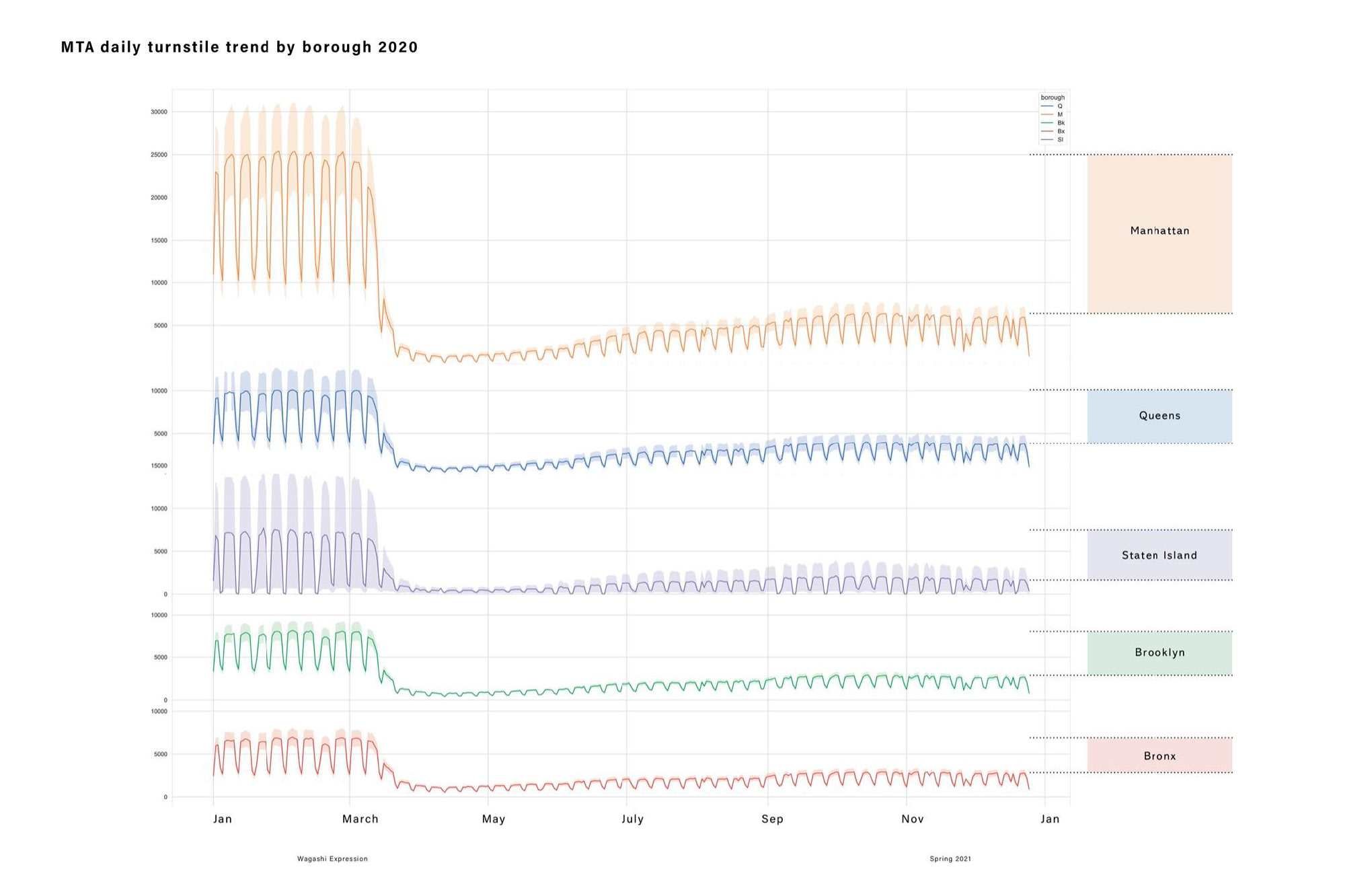
Diagram: Metro mobility trend of different boroughs
3.1
METRO
Based on the daily turnstile trend and earlier studies of mobility behavior, we can see that the general trend is the amount of passenger taking metro dropped to the lowest during the lock-down. The number gradually increase during the proceeding months, but it didnt’t increase back to the normal amount. Manttan has the largest change and Bronx has the lowest.
3.2
DATA ANALYSIS
Based on the daily turnstile trend and earlier studies of mobility behavior, we can see that the general trend is the amount of passenger taking metro dropped to the lowest during the lock-down. The number gradually increase during the proceeding months, but it didnt’t increase back to the normal amount. Manttan has the largest change and Bronx has the lowest.

Picture: Data Visualization process
4.0
PHYSICALIZATION
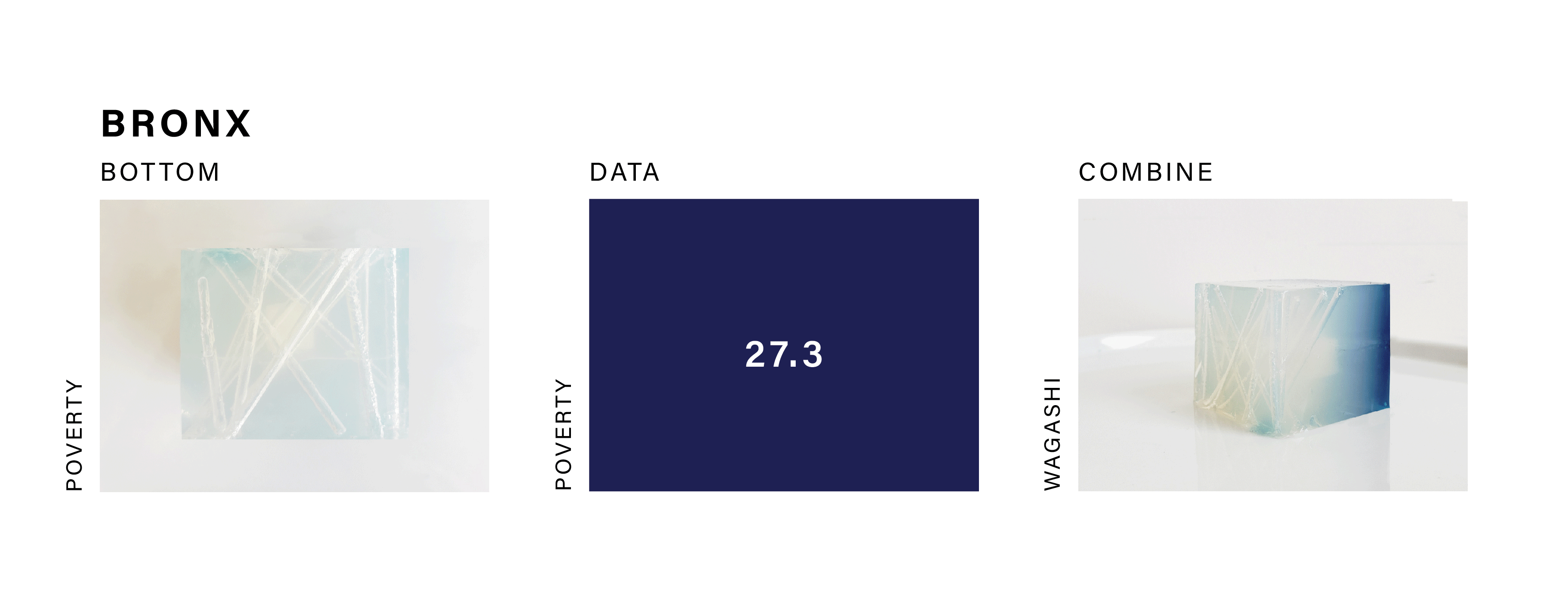
For our final wagashi, we looked at poverty rate, density, and %change of transportation method of each individual boroughs. We uses size of the cube inside the wagashi to show the %change of mobility behavior before and after pandemic. As mentioned earlier, we uses the amount of tube void showing the poverty rate. The higher poverty rate with more tubes, and lower with less. The density is represented by the change of color showing the density of each boroughs.


Picture: Final wagashi